From Linear Regression to Machine Learning
Predicting the future feels like fortune teller stuff, but in the world of machine learning, it’s mostly a math problem. The simplest version is the straight-line trend: one input, a line through the data, and then a guess for what happens next. The real world is rarely that simple though. Outcomes are almost never explained by just one thing, and the patterns they trace aren’t always straight.

In this post, we’ll move beyond a single line into multiple predictors and curved relationships, and we’ll see how the fit/predict/loss/generalization pattern that falls out becomes the basic shape of machine learning.
We’ll use one running example throughout: the classic Advertising dataset. It has 200 markets with TV, radio, and newspaper budgets (in thousands of dollars) and the resulting sales (in thousands of units).
import pandas as pd

advertising = pd.read_csv('Advertising.csv', index_col=0)
advertising.head()
#       TV  radio  newspaper  sales
# 1  230.1   37.8       69.2   22.1
# 2   44.5   39.3       45.1   10.4
# 3   17.2   45.9       69.3    9.3
# 4  151.5   41.3       58.5   18.5
# 5  180.8   10.8       58.4   12.9
From Correlation to Prediction
Before we can predict anything, we have to ask a smaller question: do two variables actually move together? That’s what correlation measures. And once we believe two variables are linked, regression is the tool that turns that link into an actual prediction formula. This section is the bridge from one to the other.

Covariance and Pearson’s r
The first concept is covariance, which is the average product of centered values:
Cov(X, Y) = (1 / (n - 1)) * sum((Xi - x-bar)(Yi - y-bar))
The intuition is simple. For each observation, ask whether X is above or below its mean and whether Y is above or below its mean. When the two deviations tend to share the same sign (both above, or both below), covariance is positive. When they tend to have opposite signs, covariance is negative. When the signs are mixed, the contributions cancel and covariance lands near zero.
The problem with covariance is that its units depend on the units of X and Y. A covariance between TV ad spend and sales doesn’t tell you whether the relationship is strong or weak, because the number has no natural scale.
Pearson’s correlation coefficient r fixes that by dividing covariance by the sample standard deviations of X and Y:
r = Cov(X, Y) / (s_X * s_Y)
That standardization gives a unitless number bounded between -1 and 1. A value of 1 means perfect positive linear correlation, -1 means perfect negative linear correlation, and 0 means no linear relationship. Now you can compare strength across very different kinds of variables on the same scale.
import numpy as np

# Covariance between TV spend and sales (units depend on the variables)
np.cov(advertising['TV'], advertising['sales'])[0, 1]

# Pearson's r is the unitless, bounded version
np.corrcoef(advertising['TV'], advertising['sales'])[0, 1]
# 0.7822
One quick warning before we move on: a strong correlation doesn’t mean one variable causes the other. The classic examples are police presence and crime rate, or Master’s degrees awarded and box-office revenue. In both cases, a third factor is driving the apparent link. Correlation is a starting point, not a verdict.
The Mean as Baseline

Suppose you’re a marketing analyst and you want to predict sales for a new market. If you know nothing else about that market, and you’re measuring mistakes with squared error, the best single-number guess is the average sales across the markets you have data for. That’s a baseline prediction: a single horizontal line at the mean.
baseline = advertising['sales'].mean()
print(f"Baseline guess for any market: {baseline:.2f} thousand units")
Why start here? Because any model you build later has to beat this baseline to be worth the trouble. The mean line gives you a fixed yardstick to measure improvement against. The next step is to ask whether you can do better by bringing in a second variable, like that market’s TV ad budget. If TV spend and sales are correlated, then knowing the budget should let you shift your guess up for high-spend markets and down for low-spend ones, instead of always guessing the average.
That shift is the core idea of regression. The mean line is the “I know nothing” prediction, and the regression line is the “I know one more thing” prediction.
Simple Linear Regression

Simple linear regression makes that idea precise. It models a quantitative response Y using a single predictor X, assuming the relationship is approximately linear:
Y = beta0 + beta1 X + epsilon
Here beta0 is the intercept (the predicted mean of Y when X is zero), beta1 is the slope (how much the fitted mean of Y changes per unit change in X), and epsilon is the part the line does not explain. The prediction the model produces for an observation is written Y-hat. SciPy’s linregress gives us the fitted slope and intercept in one call:
from scipy.stats import linregress

result = linregress(advertising['TV'], advertising['sales'])
print(f"sales = {result.intercept:.4f} + {result.slope:.5f} * TV")
# sales = 7.0326 + 0.04754 * TV
So each additional $1,000 spent on TV is associated with about 47.5 more units sold on average. The intercept is the fitted sales value when TV spend is zero: about 7,033 units. These are still model estimates from observational data, not proof that changing TV spend would cause exactly that change in sales.
Of course the line won’t pass through every point exactly. The gap between what actually happened for market i and what the model predicted is called a residual:
e_i = y_i - y-hat_i
You’ll also see the opposite sign convention, y-hat_i - y_i; for RSS, the sign disappears when we square it.
y_hat = result.intercept + result.slope * advertising['TV']
residuals = advertising['sales'] - y_hat
Residuals are the misses. They’re how the model tells you where it was wrong, and as we’ll see in the next section, they’re also how the model is fit in the first place. The best line is the one that keeps those misses as small as possible overall.
This is where regression starts to look meaningfully different from correlation. Correlation summarizes whether two variables move together. Regression goes further: it specifies the form of the relationship and gives you a rule you can plug new inputs into. Given a TV budget of $250 thousand, the model hands you back a predicted sales number directly:
predicted = result.intercept + result.slope * 250
print(f"Predicted sales at TV = $250k: {predicted:.2f} thousand units")
That’s the jump from describing data to predicting from it.
How the Model Is Fit
So far we have a model shape, Y = beta0 + beta1 X + epsilon, but no rule for picking the actual values of beta0 and beta1. Out of the infinite number of lines you could draw through a scatterplot, which one is best, and what does “best” even mean? This section walks through how the fit is chosen, how good that fit is, and how confident we should be in the numbers it spits out.
Residual Sum of Squares
The natural starting point is to score each candidate line by how badly it misses the data. Each observation has a residual e_i = y_i - y-hat_i, so a reasonable summary is to add them all up. The catch is that raw residuals can have opposite signs and cancel each other out. A line that is +5 off on one point and -5 off on another would look perfect by that measure, even though it missed twice.
The fix is to square each residual before adding, which gives the residual sum of squares:
RSS = e_1^2 + e_2^2 + ... + e_n^2
Squaring kills the sign problem and makes large misses count more than small ones. The smaller the RSS, the better the line fits the data overall.
rss = (residuals ** 2).sum()
print(f"RSS for the TV-only line: {rss:.2f}")
Least Squares

Once RSS is the score, fitting becomes an optimization problem: pick the values of beta0 and beta1 that make RSS as small as possible. This is called ordinary least squares, or OLS for short.
For simple linear regression, this minimization has an exact closed-form answer. The slope and intercept are:
beta1 = sum((x_i - x-bar)(y_i - y-bar)) / sum((x_i - x-bar)^2)
beta0 = y-bar - beta1 * x-bar
You don’t have to search or guess. You plug your data into those two formulas and the best-fitting line falls out:
x = advertising['TV']
y = advertising['sales']
x_bar, y_bar = x.mean(), y.mean()

beta1 = ((x - x_bar) * (y - y_bar)).sum() / ((x - x_bar) ** 2).sum()
beta0 = y_bar - beta1 * x_bar
print(f"Closed-form fit: sales = {beta0:.4f} + {beta1:.5f} * TV")
# Closed-form fit: sales = 7.0326 + 0.04754 * TV
Same numbers linregress gave us. In practice, you’d just call linregress or use statsmodels, which also throws in extras like standard errors, p-values, and confidence intervals out of the box.
Keep in mind that closed-form solutions like this are the exception, not the rule. Simple linear regression has a closed-form answer, and multiple linear regression and polynomial regression use the same kind of linear-algebra solution when they are fit with ordinary least squares. Polynomial regression can do that because it is still linear in the coefficients after the feature transformation. In practice, software also has to handle rank and numerical issues in the design matrix. Many other models, including logistic regression and neural networks, do not have a simple algebraic shortcut. For those, fitting becomes an iterative search: methods like gradient descent take small steps in a direction that reduces the loss until they cannot improve much more. The high-level idea is the same though: define a loss function, and pick parameters that minimize it.
Gradient Descent
So what does that iterative search actually look like? This idea is worth getting comfortable with, because the same idea shows up in many modern ML models.

Picture the loss as a curved surface. Each combination of beta0 and beta1 lands you at some height on that surface, and the height is the value of RSS (or MSE, the same thing scaled by 1/n). Your goal is to find the lowest point. Gradient descent’s strategy is dead simple: look at the slope under your feet, take a small step downhill, look again, repeat. For least squares, the surface is a single bowl with one true bottom, so a well-chosen learning rate eventually gets you there.
The “slope under your feet” is the gradient, the partial derivatives of the loss with respect to each parameter. For our line, using prediction errors y-hat_i - y_i inside the derivative:
dMSE/dbeta0 = (2/n) * sum(beta0 + beta1*x_i - y_i)
dMSE/dbeta1 = (2/n) * sum((beta0 + beta1*x_i - y_i) * x_i)
Each one tells you how the loss changes when you nudge that parameter a little. To go downhill, subtract a small multiple of the gradient (the “learning rate”) from each parameter, then do it all over again with the new values:
# Standardize TV first. Gradient descent is much better behaved when
# features are on similar scales.
x_raw = advertising['TV'].values
y = advertising['sales'].values

x_mean = x_raw.mean()
x_std = x_raw.std()
x = (x_raw - x_mean) / x_std

n = len(x)
beta0, beta1 = 0.0, 0.0
learning_rate = 0.01

for step in range(2000):
    y_hat = beta0 + beta1 * x
    errors = y_hat - y

    grad_beta0 = (2 / n) * errors.sum()
    grad_beta1 = (2 / n) * (errors * x).sum()

    beta0 -= learning_rate * grad_beta0
    beta1 -= learning_rate * grad_beta1

# Convert back from standardized coordinates to the original TV scale
beta1_raw = beta1 / x_std
beta0_raw = beta0 - beta1_raw * x_mean

print(f"Gradient descent fit: sales = {beta0_raw:.4f} + {beta1_raw:.5f} * TV")
# Gradient descent fit: sales = 7.0326 + 0.04754 * TV
Same answer the closed form gave us, no algebra required. The model just walked downhill until it hit the bottom.
A few gotchas to know about:
- The learning rate matters a lot. Too small, and convergence drags on forever. Too big, and you overshoot the minimum and bounce around (or in bad cases, diverge entirely). Picking a good value is half the battle.
- Scale your features. Notice we standardized TV before running the loop. Raw TV values go up to about
300, so the gradient onbeta1can be much larger than the gradient onbeta0. A learning rate that behaves well for one parameter can blow up the other. Standardizing makes the loss surface better conditioned and lets the steps stay balanced. - Real implementations are fancier. Production code uses tricks like momentum, adaptive learning rates (Adam, RMSprop), and mini-batches that compute the gradient on small chunks of data instead of the full dataset. But the core loop is exactly what you just saw: look at the gradient, step downhill, repeat.
This is also why the loss-function-and-minimize framing matters so much. For convex problems like ordinary least squares, gradient descent can converge to the global minimum when the learning rate is chosen well. For harder non-convex models, gradient descent and its cousins search for a good minimum, with no guarantee it’s the best one. That optimization recipe is behind a lot of modern machine learning, from small regressions to large neural networks.
Explained Variance
A small RSS means the line fits well, but small compared to what? The answer goes back to the mean baseline. Remember, before the regression line existed, our prediction for every point was just the average of Y. That baseline has its own total sum of squares, usually called TSS, and the regression line has its residual sum of squares, RSS. The improvement of one over the other is exactly what R^2 measures:
R^2 = 1 - RSS / TSS
On the training data for an ordinary least-squares model with an intercept, the regression line cannot do worse than the mean line, so R^2 lands between 0 and 1. A value of 1 means the line explains all the variation. A value of 0 means it does no better than the mean. On held-out data, or in models without an intercept, R^2 can be negative.
y_tv = advertising['sales']
y_hat_tv = result.intercept + result.slope * advertising['TV']

tss = ((y_tv - y_tv.mean()) ** 2).sum()
rss_tv = ((y_hat_tv - y_tv) ** 2).sum()
r_squared = 1 - rss_tv / tss
print(f"R^2 = {r_squared:.3f}")
# R^2 = 0.612

# Equivalently, in this simple-linear case:
print(f"R^2 = {result.rvalue ** 2:.3f}")
For the Advertising data with TV as the predictor, the Pearson correlation is about 0.7822, so R^2 is about 0.612. TV spending alone explains about 61% of the variation in sales. The other 39% is not explained by this one linear predictor; it may be noise, nonlinear structure, or signal from other variables.
One caveat: a low R^2 doesn’t always mean X is useless. It can also mean the relationship isn’t linear, and a curved model would do better. We’ll come back to that.
Bootstrap Confidence Intervals
The slope and intercept that least squares produces aren’t eternal truths. They’re estimates from one particular sample of data. If you collected a different sample of 200 markets, you’d get slightly different numbers. So the natural follow-up: how much would the fitted line wiggle if you kept pulling similar datasets?
The bootstrap answers that empirically, without assuming the errors follow a neat normal distribution. It still relies on the original sample being reasonably representative, and on observations being independent enough that resampling rows makes sense. The recipe is:
- Resample the original data with replacement, keeping the same sample size.
- Refit the regression on the resampled data.
- Record the new
beta0andbeta1. - Repeat thousands of times.
n = len(advertising)
n_bootstraps = 50_000
intercepts = np.empty(n_bootstraps)
slopes = np.empty(n_bootstraps)

rng = np.random.default_rng(0)
for i in range(n_bootstraps):
    idx = rng.integers(0, n, size=n)
    sample = advertising.iloc[idx]
    fit = linregress(sample['TV'], sample['sales'])
    intercepts[i] = fit.intercept
    slopes[i] = fit.slope

intercept_ci = np.percentile(intercepts, [2.5, 97.5])
slope_ci = np.percentile(slopes, [2.5, 97.5])
print(f"95% CI for intercept: {intercept_ci}")
print(f"95% CI for slope:     {slope_ci}")
# 95% CI for intercept: about [6.40, 7.70]
# 95% CI for slope:     about [0.042, 0.053]
The collected slopes and intercepts form an empirical distribution, and the middle 95% of that distribution gives you a percentile bootstrap confidence interval for each parameter. For our Advertising fit, 50,000 bootstrap resamples produce a 95% interval of about [6.40, 7.70] for the intercept and [0.042, 0.053] for the slope.
Two takeaways. First, regression coefficients come with uncertainty, and that uncertainty is something you can estimate. Second, if those bootstrap intervals are tight, the fitted line is relatively stable under resampling. That still does not prove the model is causal or unbiased. If the intervals are wide, the data isn’t pinning down the parameters very well, and you should be careful about how strongly you read into the result.
Multiple Linear Regression

We’ve squeezed about as much as we can out of TV alone. But the Advertising dataset has two more predictors sitting right there: radio and newspaper. A real marketing team would obviously care about all three at once, not one at a time. So let’s bring them in.
From Line to Hyperplane
You might think the easiest move is to just fit three separate single-predictor regressions, one per channel, and add the results together. Don’t. That approach ignores how the predictors relate to each other and double-counts shared signal. The right move is to fit one model that sees all the predictors at the same time.
That’s multiple linear regression. Instead of one slope and one intercept, you get one slope per predictor:
y = beta0 + beta1*x1 + beta2*x2 + ... + beta_p*x_p + epsilon
Geometrically, simple linear regression gave us a line in 2D. Multiple regression gives us a flat surface in higher-dimensional space: a plane when there are two predictors, a hyperplane when there are more. You can’t really picture it past 3D, but the math doesn’t care.
Holding Others Constant
Here’s the key thing to know about these coefficients. Each beta_i is a partial slope: the average fitted change in y associated with a one-unit increase in x_i while the other predictors are held fixed in the model. That phrase “holding others constant” really matters. The coefficient on TV stops meaning “how much does the fitted sales value change when TV changes by itself?” and starts meaning “how much does the fitted sales value change when TV changes, assuming radio and newspaper don’t change?”
Let’s fit it. statsmodels makes this easy with R-style formula syntax:
import statsmodels.formula.api as smf

model = smf.ols('sales ~ TV + radio + newspaper', data=advertising).fit()
print(model.params)
# Intercept    2.9389
# TV           0.0458
# radio        0.1885
# newspaper   -0.0010
Holding the other channels fixed, each additional $1,000 of TV spend is associated with about 45.8 more units sold. Each additional $1,000 of radio spend is associated with about 188.5 more units. In this fitted model, radio has a much larger fitted partial association per dollar than TV. These are still associations, not proven causes, unless the data came from a controlled experiment.
Collinearity and the Newspaper Effect
Newspaper, on the other hand, is doing basically nothing. The coefficient is roughly zero, and model.summary() will confirm it’s not statistically significant.
Here’s where it gets weird though. If you fit newspaper by itself, you’d get a coefficient of about 0.055 (so each $1,000 looks like it’s worth about 54.7 more units in that single-predictor model). That looks meaningful at first:
solo = smf.ols('sales ~ newspaper', data=advertising).fit()
print(f"Newspaper alone: {solo.params['newspaper']:.4f}")
# Newspaper alone: 0.0547
So why does newspaper drop to zero in the full model?
The answer: newspaper and radio are themselves correlated, at about 0.35. When you fit newspaper alone, some of the credit it gets is shared signal from radio. Once the multiple model can see both columns, radio explains most of that shared predictive variation and newspaper has little unique signal left.
print(advertising[['radio', 'newspaper']].corr().iloc[0, 1])
# 0.354
This is one version of the broader collinearity problem, and it’s one of the main things that makes multi-predictor coefficients tricky to read. The radio-newspaper correlation here is only moderate, but the lesson still applies: the more two predictors move together, the harder it is for the model to separate their unique contributions. Newspaper’s marginal relationship mostly disappears once radio is controlled for.
Rising R^2 and Overfitting
One more wrinkle. On the training data for an ordinary least-squares model with an intercept, adding more predictors will never make R^2 go down, even if the new predictor is mostly noise. That’s just how R^2 is defined: any extra column gives the model another knob to turn on the training data.
print(f"TV only            R^2 = {smf.ols('sales ~ TV', data=advertising).fit().rsquared:.3f}")
print(f"TV + radio         R^2 = {smf.ols('sales ~ TV + radio', data=advertising).fit().rsquared:.3f}")
print(f"TV + radio + news  R^2 = {smf.ols('sales ~ TV + radio + newspaper', data=advertising).fit().rsquared:.3f}")
# TV only            R^2 = 0.612
# TV + radio         R^2 = 0.897
# TV + radio + news  R^2 = 0.897
Notice the jump from TV-only to TV+radio is huge, but tossing newspaper in barely changes anything. That’s actually telling you something useful: newspaper isn’t pulling its weight in this fitted model. The bigger lesson is that you can’t just keep adding predictors and trust R^2 to tell you when to stop. We’ll come back to this in the last section.
Nonlinear Relationships
So far we’ve assumed the relationship between predictor and response is roughly a straight line. That’s a strong assumption, and the real world doesn’t always cooperate. Time to see what happens when it breaks.
When a Straight Line Fails
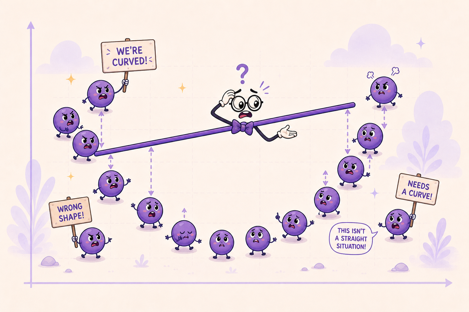
The most direct way to spot a bad linear fit is to look at the residuals. If the model is right, the residuals should look like random noise scattered around zero. If they show structure (a curve, a wave, a U-shape), that’s the model telling you the line is the wrong shape.
import matplotlib.pyplot as plt

tv_fit = linregress(advertising['TV'], advertising['sales'])
tv_residuals = advertising['sales'] - (tv_fit.intercept + tv_fit.slope * advertising['TV'])

plt.scatter(advertising['TV'], tv_residuals)
plt.axhline(0, color='red')
plt.xlabel('TV')
plt.ylabel('residual')
plt.show()
To make this fail mode super obvious, imagine the true relationship is actually quadratic, something like y = 30 - 0.3x + 0.005x^2 + noise. If you fit a straight line to that, the residuals don’t come out random. They come out U-shaped: positive on the ends, negative in the middle. The errors have a pattern, which means the line is missing curvature that’s really there.
That’s the whole signal. Whenever residuals show a pattern, your model is missing some structure. Curvature is one possible fix, but the issue could also be an omitted predictor, an interaction, changing variance, or outliers.
Nearest Neighbor Regression
Alright, the line is the wrong shape. What now? One option: stop forcing a single global formula. Predict each new point by looking at its neighbors instead.
Nearest neighbor regression is the simplest version of this. To predict sales at some target TV budget, grab the few markets with the closest TV budgets and average their sales:
def knn_predict(target_tv, data, k=10):
    neighbors = (
        data.assign(distance=(data['TV'] - target_tv).abs())
            .nsmallest(k, 'distance')
    )
    return neighbors['sales'].mean()

knn_predict(150, advertising, k=10)
The distance calculation is the whole trick. Find the k rows whose TV budgets are closest to the target, then average their y values. For one-dimensional data you can make this faster with sorting and np.searchsorted, but the prediction rule is still “average the nearest neighbors.”
This is flexible enough to handle curves, since you’re not forcing one global formula on the whole dataset. The downsides: it gets slow on big data, it’s sensitive to outliers, and it gets unreliable near the edges of the data where the nearest neighbors are one-sided and can be farther away.
Step Functions
Another option: chop the predictor into bins and fit a constant inside each bin. That turns a continuous variable into an ordered categorical one, and inside each bin the prediction is just the average y for the rows that landed there.
advertising['TV_bin'] = pd.cut(advertising['TV'], bins=10)
step_fit = advertising.groupby('TV_bin', observed=True)['sales'].mean()
print(step_fit)
The result is a staircase. Easy to understand, but the staircase has artificial jumps at the bin edges. Two markets with nearly identical TV budgets can land in different bins and get totally different predictions, which is a weird property if you think the underlying relationship is actually smooth. The fit also depends on how you choose the bins: 9, 10, 11 bins can all produce noticeably different staircases.
Polynomial Regression
Here’s the most useful trick. What if we just let the line bend?
Polynomial regression does exactly that, in a sneaky way: it adds higher powers of x (x^2, x^3, …) as new columns, and then runs ordinary linear regression on the bigger column set. The model is still linear in the coefficients, just curved in x.
A degree-3 polynomial looks like:
y = beta0 + beta1*x + beta2*x^2 + beta3*x^3
If you let A = x, B = x^2, C = x^3, this has the exact same shape as multiple linear regression with three predictors. We already know how to fit that.
scikit-learn handles the column expansion for you:
from sklearn.preprocessing import PolynomialFeatures
from sklearn.linear_model import LinearRegression

X = advertising[['TV']].values
poly = PolynomialFeatures(degree=2, include_bias=False)
X_poly = poly.fit_transform(X)
# Each row goes from [TV] to [TV, TV^2]

model = LinearRegression().fit(X_poly, advertising['sales'])
print(model.coef_, model.intercept_)
That’s the whole technique. Take your one input column, build a few extra polynomial columns, hand the bigger table to the same regression solver. The fitted curve can now bend, even though under the hood we’re still doing linear regression on transformed features.
Choosing the Right Complexity

We just got a tool that can bend the curve as much as we want. That sounds great until you ask: how do we know when to stop?
Higher Degrees, Lower Training RSS
Higher-degree polynomials can only match or lower the training RSS. A degree-2 fit can beat a line. Degree-5 can beat degree-2. Push the degree high enough and the curve can start contorting sharply around individual training points. With enough degree relative to the number of distinct x values, a polynomial can even interpolate the training data exactly. That does not mean the model is good. It means it is flexible enough to memorize noise.
from sklearn.pipeline import make_pipeline
from sklearn.preprocessing import StandardScaler

X = advertising[['TV']].values
y = advertising['sales'].values

for degree in [1, 2, 5, 9, 25]:
    fit = make_pipeline(
        StandardScaler(),
        PolynomialFeatures(degree=degree, include_bias=False),
        LinearRegression(),
    ).fit(X, y)
    train_rss = ((fit.predict(X) - y) ** 2).sum()
    print(f"degree {degree:2d}: training RSS = {train_rss:.2f}")
In exact least squares, ignoring numerical issues, the training RSS never goes up as the degree climbs, because each higher-degree model keeps the old columns and adds another one. The StandardScaler step matters here because very high-degree raw powers can become numerically unstable. And if you actually plotted the degree-25 fit against the data, you’d often see weird oscillations between the data points, bending wildly to hug the training set and saying little about the underlying pattern. That’s overfitting. The model has stopped learning the real signal and started chasing noise.
Train/Validation Split
The fix is to evaluate the model on data it hasn’t seen during training. The simplest version: hold out part of your dataset before fitting. Train on one slice, score on the other.
from sklearn.model_selection import train_test_split
from sklearn.metrics import mean_squared_error

X_train, X_val, y_train, y_val = train_test_split(
    X, y, test_size=0.2, random_state=42
)

for degree in [1, 2, 3, 5, 9]:
    fit = make_pipeline(
        StandardScaler(),
        PolynomialFeatures(degree=degree, include_bias=False),
        LinearRegression(),
    ).fit(X_train, y_train)
    train_mse = mean_squared_error(y_train, fit.predict(X_train))
    val_mse = mean_squared_error(y_val, fit.predict(X_val))
    print(f"degree {degree}: train MSE = {train_mse:.3f}, val MSE = {val_mse:.3f}")
Now watch what the validation error does as the polynomial degree climbs. Training error keeps falling, but validation error usually bottoms out at some sweet spot and then starts climbing again. That climb is overfitting: the model is getting better at the training set and worse at everything else.
The polynomial degree where the validation error is lowest is your pick for that split. In real projects, cross-validation is usually more stable than trusting one random split, and a final held-out test set is useful if you need an honest final estimate after tuning. And this isn’t just a polynomial trick. The train/validation idea is the standard machine-learning move for tuning any complexity knob, on basically any model.
Ridge and Lasso
For more complex models with lots of parameters, picking one knob isn’t enough. You might have dozens of features, each with its own coefficient. Ridge regression and lasso regression help here by pushing the model toward simpler solutions automatically.
The basic idea: instead of just minimizing RSS, you minimize RSS plus a penalty on the size of the coefficients. Ridge uses an L2 penalty, while lasso uses an L1 penalty. The penalty discourages the model from leaning too hard on any single coefficient, which keeps it from chasing noise. Lasso goes a step further and can drive some coefficients all the way to zero, effectively dropping irrelevant predictors entirely. Because the penalty depends on coefficient size, you usually standardize features before using ridge or lasso.
These methods deserve their own post to do justice, but the high-level message matters here: when complexity gets out of hand, you’ve got tools that shrink unnecessary complexity.
From Regression to Machine Learning
Everything we’ve done in this post actually fits inside a much bigger picture called machine learning. ML is just a name for the family of techniques that learn patterns from data instead of relying on hand-coded rules. Tom Mitchell’s classic definition pins it down nicely: a program learns when its performance on some task T, measured by some metric P, improves with experience E. For us, T is “predict sales”, P is something like RSS or R^2, and E is the Advertising dataset. We’ve been doing ML the whole time.

Where Regression Fits
ML is usually carved up into three big categories:
- Supervised learning: the training data come with the right answers (called labels), and the model learns the input-to-output mapping. Regression and classification both live here.
- Unsupervised learning: the data are unlabeled, and the model looks for structure on its own. Clustering, dimensionality reduction, and anomaly detection are the typical examples.
- Reinforcement learning: an agent interacts with an environment, takes actions, gets rewards or penalties, and learns a policy. Some robotics and control problems use this framing, and game-playing agents are the classic example.
Regression, the focus of this post, is the supervised case where the label is a continuous number (sales, temperature, price). When the label is a category instead (spam or ham, dog or cat, default or no default), the supervised problem is called classification. Same shape, different output type.
The Common Interface
A big reason scikit-learn became one of the standard Python libraries for ML is that it wraps a huge list of different algorithms in one consistent interface. Doesn’t matter what the model is, the moves are the same:
- Build it with chosen options:
model = SomeModel(param=value) - Train on data:
model.fit(X, y) - Predict on new data:
model.predict(X_new) - For probability outputs, when supported:
model.predict_proba(X_new) - For transformations:
model.transform(X)ormodel.fit_transform(X)
The expected input shape is also standard: X is a 2D matrix of shape (N, D), where N is the number of samples and D is the number of features. y is a 1D array of length N with the labels.
We can rerun our multiple regression in this exact pattern:
from sklearn.linear_model import LinearRegression

X = advertising[['TV', 'radio', 'newspaper']].values  # shape (200, 3)
y = advertising['sales'].values                        # shape (200,)

model = LinearRegression().fit(X, y)
print(model.predict([[150, 30, 20]]))
# Predicted sales for a market with TV=150, radio=30, newspaper=20
Same model we fit with statsmodels earlier, just dressed up in the scikit-learn pattern. The big win is that you can swap LinearRegression for RandomForestRegressor, GradientBoostingRegressor, or even a small neural network, and the rest of your code keeps working.
From Linear to Logistic Regression
What if we wanted to predict not how many units sold, but whether a market is a high-sales market or not? That’s the classification version of the same question.
Logistic regression is the shortest bridge from where we are now. It takes the same linear combination we already know and feeds it through a sigmoid function to squash the output between 0 and 1:
z = beta0 + beta1*x1 + ... + beta_p*x_p
g(z) = 1 / (1 + exp(-z))
That output is interpreted as the model’s estimated probability that the label is 1. To turn the probability into a class prediction, you pick a threshold. 0.5 is the common default, but real projects often tune the threshold around false positives, false negatives, class imbalance, or business cost.
from sklearn.linear_model import LogisticRegression

# Define a binary outcome: was this a high-sales market?
advertising['high_sales'] = (advertising['sales'] > 15).astype(int)

X = advertising[['TV', 'radio', 'newspaper']].values
y = advertising['high_sales'].values

clf = LogisticRegression(max_iter=1000).fit(X, y)
print(clf.predict_proba([[150, 30, 20]]))  # probabilities for [low, high]
print(clf.predict([[150, 30, 20]]))         # final class label
The fit / predict pattern is identical to the regression case. Under the hood the core loss is different: logistic regression uses log loss, also called cross-entropy, instead of MSE. scikit-learn’s default LogisticRegression also adds L2 regularization unless you change the penalty. The recipe is still the same: define an objective, then use an iterative numerical optimizer to find parameters that minimize it.
You also can’t fit logistic regression with a closed-form formula like ordinary least squares. There’s no closed-form algebraic shortcut for log loss. So the iterative-search idea from the Gradient Descent section isn’t optional anymore. It’s how the model gets fit at all.
Why This All Matters
Here’s the part that should ring a bell. At prediction time, logistic regression takes a weighted sum of inputs and passes it through a sigmoid. That pattern (take a weighted sum, pass it through a nonlinear activation function, output a number) is also the math behind a single sigmoid neuron in a neural network. Stack many neurons in layers, train their parameters with an optimizer, and you have the basic shape of a deep learning model.
In other words, what we’ve spent this post on isn’t peripheral to modern AI. It’s the literal atoms.
The same skeleton scales up to many models you’ll run into:
- A set of parameters the model has to learn.
- A loss function that scores how badly it’s doing.
- A fitting algorithm that uses the objective or rule to choose a model. For differentiable models, that is often gradient descent or one of its cousins.
- A fit/predict interface that’s consistent enough to let you swap models in and out.
Linear regression, multiple regression, polynomial regression, logistic regression, and neural networks all sit on that foundation. Other models use different fitting mechanics: nearest neighbors mostly stores the training data, and random forests build decision trees rather than following a differentiable gradient. But the habit is the same: know what the model learns, what objective or rule guides the fit, and how you will test whether it generalizes.
Summary
We started with a simple question (do two variables actually move together?) and ended up sketching a common pattern used across much of ML. Along the way: simple linear regression and the mean baseline it has to beat, least squares and gradient descent for actually fitting the line, R^2 for measuring the fit, and the bootstrap for measuring its uncertainty. Then we scaled up. Multiple regression handled several predictors at once and exposed the collinearity trap that comes with correlated inputs. Nonlinear methods let the model bend with nearest neighbors, step functions, and polynomial features. The train/validation split kept all that flexibility from chasing noise.
The reason these all tie together is that they share a practical modeling habit: define what the model can learn, define what good performance means, fit on training data, and check whether the result generalizes. Logistic regression layers a sigmoid and log loss on top of a linear score to handle classification. A neural network stacks many weighted sums and nonlinear activations into layers. Tree models and nearest-neighbor methods use different mechanics, but the same questions still apply: what is being learned, how is it fit, and how well does it predict data it has not seen?
Comments